
As the Olympians competing in Milan-Cortina going into their last and final week, Czechia’s opening ceremony outfits have garnered all types of attention and mixed reviews. Rather than the typical white coats seen through previous years, the Czech athletes fashioned bright and bold color-blocked knitwear.
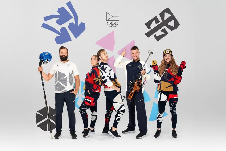
The eye-catching designs, pitched by Milan Jaroš, were inspired by Czech artist and typographer Vojtech Preissig. Czech Olympians sported knitted sweaters, shorts, leggings, mittens, and hats with enlarged versions of five of Preissig’s distinct symbols: three clustered arrows, two resembling blooming flowers, another block-like leaf, and two clusters of three small triangles (fig. 1). Reading a page of printed text, these symbols would be easy to spot, but on the outfits, the symbols are blown up so large and color-blocked in such a way that viewers must look closely to recognize them in this new context—so large, in fact, that they risk dissolving into a dense field of pattern and color. At first glance, their abstraction can appear to push toward visual experimentation or fashion spectacle. These design choices, however, were highly intentional.
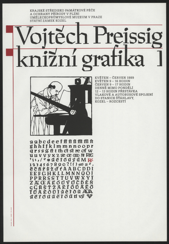
Preissig’s typography was a particularly significant contribution to modern print culture, as it included letters with diacritical marks—accents such as háčeks and other modifiers—at a time when printers were required to add these marks manually (fig. 2). Known for its distincly block-like, angular look, and developed in 1925, the Preissig Antiqua typeface is still used to this day.
Diacritics make the Czech language what it is, and having the language in print in a manner, validated the language. Preissig particularly used printmaking as a political tool. After beginning to teach at the Massachusetts Institute of Technology in 1910, he created posters and materials encouraging Czech-Americans to support the national cause during World War I. After two decades in the United States, he returned to Czechoslovakia, where he joined the anti-Nazi resistance during World War II, producing the underground magazine V Boj (Into the Fight). He ultimately died for the cause, arrested by the Gestapo and imprisoned in the Dachau concentration camp—serving a sentence for the work he did to rally the Czechoslovak people.
The Olympic collection brings attention to these small didactics, symbols that were often used as small details upset in alphabets or decorative elements between lines or at the beginnings of paragraphs. This emphasis aligns with what the Olympic games represent—the gathering of outstanding, independent athletes who compete on the global stage while supporting their team and nation—a collective spirit that Preissig himself died for. As Jaroš speaks about Preissig’s details:
“When I was looking for a motif that could become the basis for the collection, or for the overall visual identity of the Czech Olympic team, I found about five such tiny elements […] They were very small, but when each was enlarged individually, it turned out they were absolutely amazing: completely autonomous artistic signs that worked beautifully even at a large scale. So that became the basis for further work.”
Despite initial criticism, the journey of these typographic elements closely aligns to the broader aims of the Olympic games: the magnification of smaller details mirrors the trajectory of the Olympic athletes themselves—individuals emerging from a relatively small nation, and stepping onto a global platform, representing not only personal excellence, but an entire country. Jaroš’ vision for the design was ultimately understood when the entire Czech team walked out together in a sea of knitted yellows, reds, whites, and dark blues. He reflected, “I perceived those reactions very positively, because they confirmed what I had expected: the collection works best when many athletes wear it together.” When these diacritical marks were integrated into the Latin alphabet, they transformed the language itself; even the smallest change in sign can alter meaning.
While such marks often go unnoticed by native speakers because of their everyday use and familarity here they are enlarged and emphasized, the bright colors set against deep blue drawing the viewer’s eye immediately. In this context, the symbols function almost like accents placed upon the athletes, highlighting them as individuals, while simultaneously reinforcing their cohesion as a team, and in a broader national narrative. In this way, the collection reveals how visual details, no matter how small, can carry histories of cultural assertion and solidarity, reminding viewers that belonging is often constructed through shared symbols, whether through a flag or through the many visual cues that come to signify a nation. Such details do not replace what already exists, but elevate and bring renewed attention to it. Through Jaroš and the Olympic Committee’s innovative designs, Preissig’s legacy lives both in print, and in the visual expression of nationhood.